A Deep Dive Into Color Theory for Modern Filmmakers

Most new directors think color is just a final step in post-production, a way to make a scene look "cool" or "moody" after the footage is already shot. That's a mistake. Color is a fundamental part of visual storytelling that begins during pre-production and dictates how an audience feels before a single line of dialogue is even spoken. This guide breaks down the mechanics of color theory, how to use palettes to drive narrative, and how to avoid the trap of over-saturated looks that pull viewers out of the story.
Why Does Color Matter in Filmmaking?
Color matters because it acts as a psychological trigger that communicates emotion, subtext, and character development without using words. It’s a tool for directing the viewer's eye and setting the internal temperature of a scene.
Think about the way a horror film uses sickly greens or a romantic comedy leans into warm, golden hues. You aren't just seeing colors; you're feeling them. If a character is feeling isolated, a cinematographer might strip the warmth out of the frame, leaving only cold blues and harsh grays. This isn't accidental. It's a deliberate choice to make the audience feel that isolation alongside the protagonist.
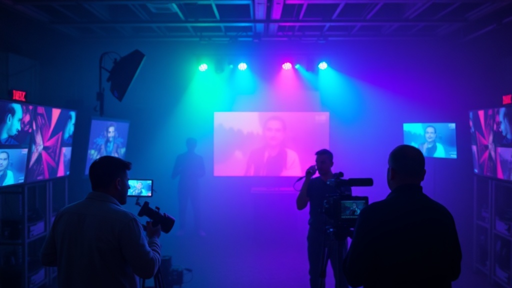
A great example of this is the work done by IMDb contributors who analyze the technical specs of iconic films. You'll notice that the most memorable shots aren't just "pretty"—they are emotionally resonant. If you're building a world, you need to decide if your colors are working for you or against you.
Don't underestimate the power of a single hue. One stray bright red in a sea of muted browns can tell the audience exactly where to look—and what to fear.
How Do I Use Color Palettes to Tell a Story?
You use color palettes by selecting specific color schemes—such as complementary, analogous, or monochromatic—to establish a consistent visual language for your film.
The most common approach is using complementary colors. These are colors that sit opposite each other on the color wheel, like teal and orange. While the "teal and orange" look is a staple in modern blockbusters, it can become a cliché if you aren't careful. The goal isn't to follow a trend; it's to create contrast. If your protagonist is wearing a bright yellow jacket in a dark, blue-toned forest, that contrast highlights their presence (or their vulnerability).
Here are the three most common palettes used in professional filmmaking:
- Monochromatic: Using various shades, tints, and tones of a single color. This creates a sense of unity or, if pushed too far, a sense of claustrophobia.
- Analogous: Using colors that are next to each other on the color wheel (like red, orange, and yellow). This feels natural and harmonious.
- Triadic: Using three colors spaced equally around the wheel. This is high-energy and can feel quite vibrant or even surreal.
When you're in the planning stages, don't just write the script. Create a visual lookbook. If you're working on a project that involves heavy sound design, remember that the visual "texture" of your color should match the auditory "texture" of your world. For instance, a gritty, low-fi film might benefit from a desaturated, grainy palette, much like the aesthetic seen in analog horror-inspired media.
What Are the Most Common Color Archetypes?
Color archetypes are established associations between specific hues and human emotions or narrative themes.
We've been conditioned by decades of cinema to react to certain colors in specific ways. It's almost subconscious. If you see a sudden shift toward high-contrast blacks and whites, your brain prepares for a shift in tone—perhaps something more clinical or noir-inspired.
The following table illustrates how certain colors are frequently used to signal specific narrative shifts:
| Color Hue | Primary Emotional Association | Narrative Use Case |
|---|---|---|
| Red | Passion, Danger, Aggression | To signal a turning point or a threat. |
| Blue | Isolation, Calm, Sadness | To establish a sense of distance or melancholy. |
| Yellow | Joy, Anxiety, Sickness | To create tension or a sense of unease. |
| Green | Nature, Growth, Decay | To represent organic life or toxic environments. |
That said, you can subvert these. If you want to truly unsettle an audience, use a "happy" color like bright pink to depict something horrific. The dissonance between the color and the action creates a much deeper sense of dread than a standard dark room ever could.
How Much Does Color Grading Affect the Final Look?
Color grading affects the final look by refining the technical color correction and adding the stylized "look" that defines the film's atmosphere.
There is a massive difference between color correction and color grading. Most beginners conflate the two. Color correction is the technical side—making sure the white balance is correct and the exposure is consistent across shots. It's about making the footage look "real" and balanced.
Color grading, however, is where the art happens. This is where you apply a specific LUT (Look-Up Table) or manually manipulate the shadows, midtones, and highlights to create a mood. If you're using professional software like DaVinci Resolve, you have an incredible amount of control over these variables. You aren't just painting over the image; you're sculpting the light.
A common mistake is over-grading. If your shadows are too blue and your highlights are too orange, the image can look "plastic." It loses its organic feel. You want to enhance the story, not drown it in a filter. If the scene is supposed to feel heavy and oppressive, don't just turn down the brightness. Adjust the color temperature to pull the light out of the skin tones and into the shadows.
It's a delicate balance. Too much saturation and you're making a music video; too little and you're making a documentary. Find the middle ground where the color serves the script, not the other way around.
The goal is to make the viewer forget they are looking at a screen and make them believe they are inside the world you've built. Whether that world is a sun-drenched desert or a neon-soaked futuristic city, the color is your most potent tool for making that world feel lived-in and real.